Elaine Rich's Quilting Page
A Gallery of Some of My Quilts

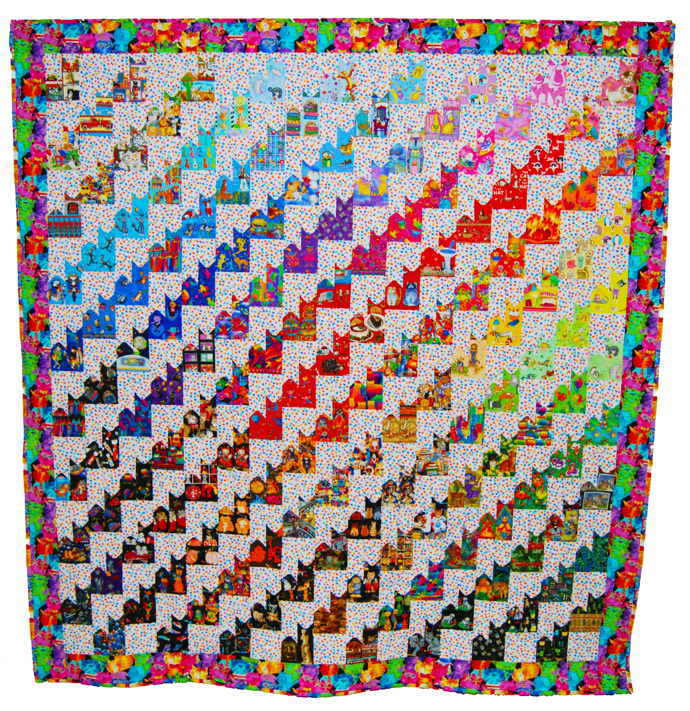
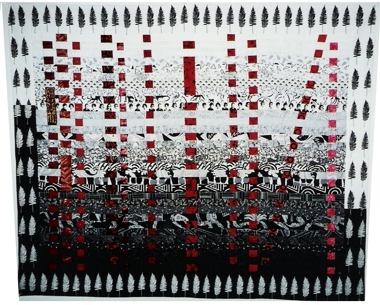
Fire Cats
2012,
96" x 101".
Cotton. Machine pieced. Machine quilted by Castle Path Quilting.
The
summer of 2011 was a bad one in central Texas.
A serious drought led to wildfires that sprang up all over the
region. The worst occurred east of
Austin around the town of Bastrop. Over
1000 homes were lost in that fire. This
quilt started out with a challenge from the Austin Area Quilt Guild: make
quilts for children who’d lost their homes.
I started making cat blocks. But
then I decided that I wanted to make sure that my quilt went to someone who
would really appreciate the cats. So I
went to talk to Scott Sutcliffe, one of the tech
support folks in the CS department.
Scott is also a volunteer firefighter in Bastrop. I knew that he and his wife Sara had lost
their home in one of the first days of the fire and had then spent the next
week and a half putting out the fire and trying to save other people’s
homes. I thought Scott would know a
family who should get my quilt. But as I
talked to him it became clear that we had our family: Scott and Sara. Of course, then the project grew from a
kid-size, twin bed quilt to a grownup size queen (and in the end almost a
king). But that’s okay. The fabrics were a lot of fun to collect.
Most of the blocks are made from cat
fabrics, but some represent Scott and Sara and their interests. There are fires, fire engines, computers,
scientists, chocolate, music, motorcycles, pine trees, bluebonnets, and
emus. Click here
for a bigger picture that shows them more clearly.
 Cranes Live for 1000 Years
2008,
Silk. Machine pieced, minimally machine
quilted.
Many
years ago, I promised my friends Cynthia and Peter Hibbard that they were next
to get a quilt. Cynthia said that she
wanted one in whites and creams and that her plan was to hang it on the wall. I’d planned to do something scrappy, maybe
like Provençal, mostly in cotton. Cynthia and I spent some time collecting,
particularly some old pieces of lace and embroidery. But then I never made the quilt. Several years (and one automata theory book
later), I decided it was time to make this quilt. By then, I’d gotten excited about working
with Japanese silks. And I had a pile of
gorgeous white ones that I’d bought intending to make an antimacassar for my
mother-in-law’s white couch. But then
she got it reupholstered and the antimacassar was no longer required. So I had the silks. One of them became the centerpiece of this
wall hanging. The panel idea came from
the kinds of things that they often hang over doors in Japan. The title comes from Japanese legend that
tells us that, “cranes live for 1000 years.”
America
2010, 86" x 68".
Cotton. Hand and machine pieced,
machine quilted, hand embellished.
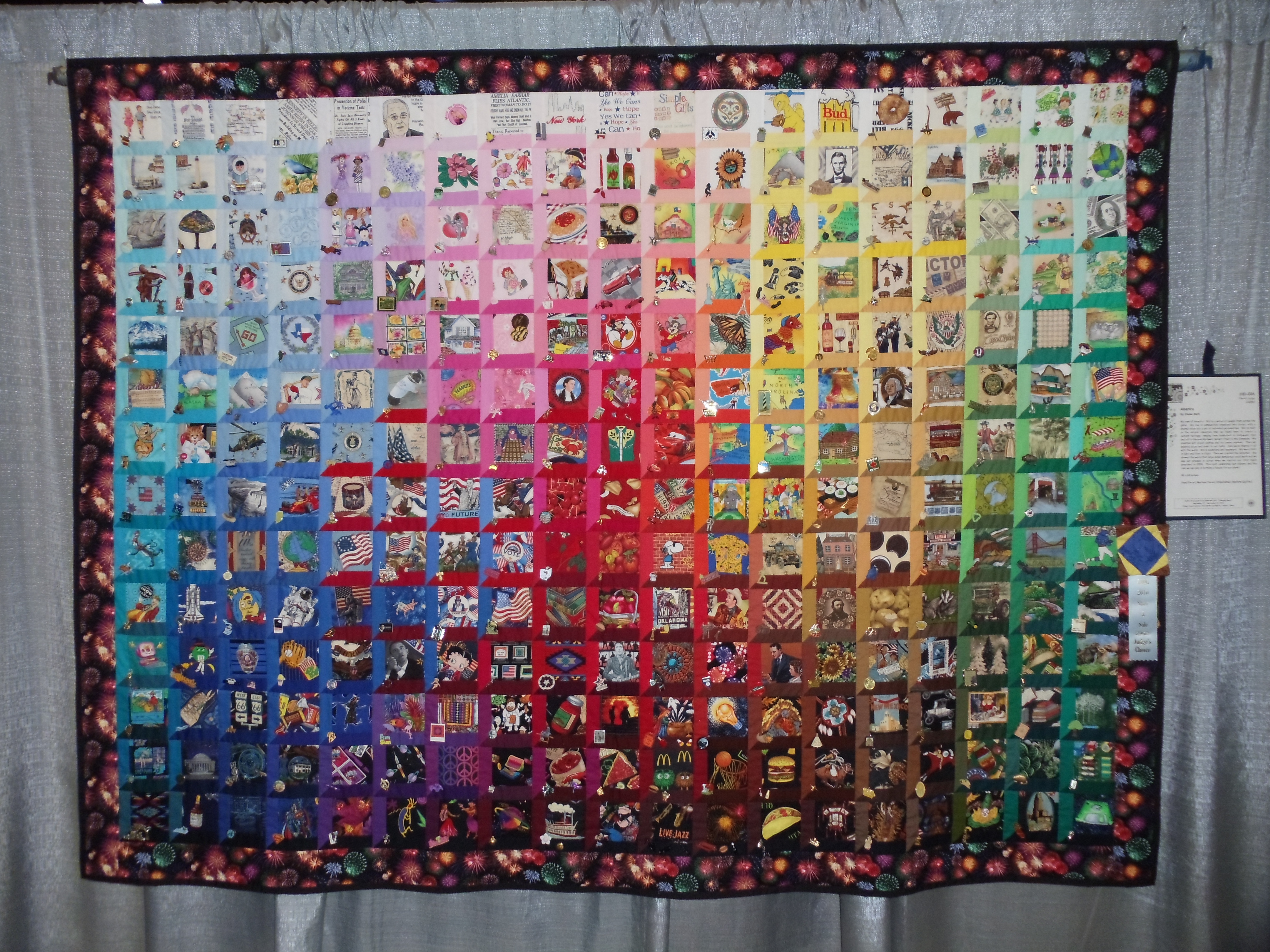 My view of
America: We're a nation of people from across the globe. We live in
communities organized into states, with a shared vision but a set of individual
personalities. We've built on the natural resources that we found here to
create a cultural heritage, ranging from basketball to
My view of
America: We're a nation of people from across the globe. We live in
communities organized into states, with a shared vision but a set of individual
personalities. We've built on the natural resources that we found here to
create a cultural heritage, ranging from basketball to
This quilt celebrates our history and the role we can play in
forming a future for our planet.
Each
block in the quilt tells a story through a combination of the fabric in the
window and the embellishments that accompany it. Click on the picture of the quilt for a
bigger image that lets you see more of the detail. You should be able to blow it up and scroll
around.
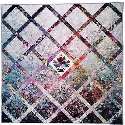
There is also a spreadsheet that describes each of the blocks, showing both the fabrics and the embellishments. You can view the blocks arranged by theme or you can sort by row and/or column to view the blocks as they appear in the quilt. (To make the sorting work correctly, you may have to indicate explicitly that there is no header row.)
 Jewels
in the Night
Jewels
in the Night
1995,
96" x 60" Predominately cotton, with silk, polyester, and velvet
center pieces.
Hand and machine pieced, machine quilted.
This quilt was commissioned
by a friend, Elaine Kant, to fill a large blank wall at the office of Scicomp, the
company she had just started. Elaine chose the basic color scheme. We both
wanted a somewhat untraditional design and I'd seen a block similar to this in
Miriam Nathan-Roberts' quilt, The Lady or the Tiger, shown in New Wave Quilt.
When first I saw that quilt, I knew that someday I wanted to make something
like it. This was the day. Although the overall design of the two quilts is
very different, the blocks are very much alike. Some of the fabrics in the
quilt were chosen for their pictures of things that interest the people who
work for the company. The peacock fabric was chosen because there's a peacock
in the woods behind their building, as well as one near Elaine's house. The
name for this quilt was chosen by the people at Scicomp;
they all submitted candidate names and then voted for their favorite. Jewels in
the Night won an award for color in the Innovative Large category at the 1996
Austin Area Quilt Guild show.
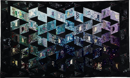
Voronoi for Ann
 2003,
Cotton. Machine pieced and quilted. Slightly embellished.
2003,
Cotton. Machine pieced and quilted. Slightly embellished.
I
made this quilt as a surprise for my friend Ann Daniel’s 50th birthday. Her husband Jim helped me spirit some
favorite photos out of the house so that I could transfer them to fabric. The design is a Voronoi
diagram. Each region has a focal point
that’s a photo that is significant to Ann.
The other fabrics in the region pick up the theme of the center
piece. So, for example, there is a
region for trips that Ann and Jim have enjoyed.
Other regions represent favorite foods, Ann’s childhood, their home in
This
design is relatively easy to make. Start
with gridded interfacing the size of the final quilt. Draw the Voronoi
diagram, then cut the interfacing on the region
boundaries. To make one region: place
the focal point somewhere in the region.
Then use the sew and flip technique, as for a log cabin, to grow the
region outward until it is completely covered (plus a seam allowance) with
fabrics. Finally, sew the regions
together, using the cut lines of the interfacing as the seam lines.
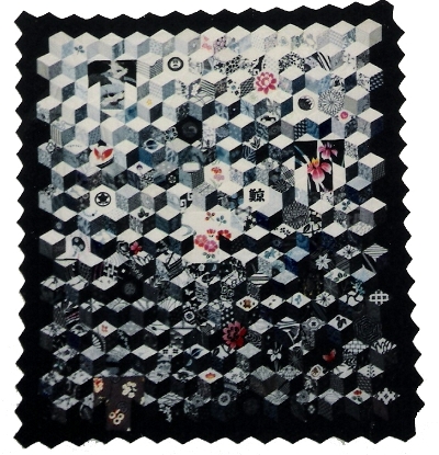
Tumbling Yukatas
1993,
55" x 60" Cotton.
Hand pieced and machine quilted.
I love the tumbling blocks
design, and I realized that, with a little cheating around the edges, I could
work a yukata shpae in
among the blocks. And without any cheating I could use some whole hexagons to
show off a few larger designs, such as the Japanese kamons
(family crests) that are appliquéed on several of the
hexagons. About half the fabrics are Japanese yukata
samples. The others are American fabrics whose designs look somewhat Japanese.
Finding such fabrics was not very difficult because blues in general are easy
to find and because Japanese designs have been very popular for the last
several years. Although most of the fabrics are blue and white, some of the yukata samples have splashes of other colors. The quilting
is primarily yukata shapes in various sizes, tumbling
down the quilt. Tumbling Yukatas was exhibited at the
1994 Austin Area Quilt Guild show.
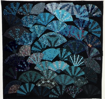 Fanfare
1993,
88" x 84" Cotton.
Machine pieced, hand appliquéed, and machine quilted.
I love teal and turquoise,
and discovered that I had collected a lot of fabrics in these colors, just because
I liked them. So I needed something to do. Fans are fun to work with because
you can make each fan out of a few fabrics that work well together, then worry later about the global design. The crazy quilt
layout made this particularly easy, since the fans didn't all have to be the
same size or the same shape. In July, 1993, my father had prostate surgery in
Washington, D.C. Alan and I went up to spend three weeks with him when he got
out of the hospital. I took a whole suitcase full of turquoise and teal fabrics
home to
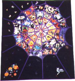 The
Web
The
Web
1997,
42" x 45" Cotton.
Machine pieced and quilted, with some hand appliqué, and many embellishments.
I started collecting
Halloween fabrics some time around 1993. I couple of years later,
I came up with the idea of making a web and filling each segment with a
different fabric. In early 1997, I drew the design and realized that I could
make the actual webbing with bias strips, the way I'd learned in the stained
glass quilt class I'd taken at my first AAQG Gift of Quilting in 1993. Dorene
Cohen decided she wanted to make one of these too, so one day,
we finally sat down and cut out our fabrics. A couple of months later we got
going again. We went to the fabric store and tried out various colors for the
webbing. Purple won, hands down. Because of the trouble I'd had hanging Round
and Round and Triangles, I decided I wanted to appliqué my web to a background
rectangle. I tried various patterned fabrics but they all competed with the
web, so black won. The most fun thing about working on this quilt was
collecting all the "doodads" that are sewn on to it. There is an
amazing amount of Halloween stuff available, so the quilt is covered with
spiders, witches, cats, webs, candy corns, and other random things. The Web was
displayed during October, 1997 at
 Five
Generations
Five
Generations
1998,
51" x 64" Cotton.
Hand pieced, machine quilted.
This was my first quilt that
exploits photos transferred to fabric. There are photos of five generations in
Alan's family, from his and his brother's children back to Alan's great grandparents.
Alan did a lot of work with the pictures to format them so they'd look good on
the quilt. We printed all the photos in black and white, and then transferred
them to colored fabrics. Most of the fabrics are hand dyes and batiks. Alan
made two labels for the back of the quilt. One shows who all the people in all
the pictures are. The other is a family tree that explains how everyone is
related. We gave the quilt to his parents for Christmas, 1998.
Blue
1996,
53" x 80" Cotton.
Machine pieced and quilted.
Making this
quilt really put my collection of blue fabrics to the test. It was a bit
different from many of the colorwashes I've done
since there were two different parallelogram shapes. It was hard to know which
column a particular fabric was going to end up in, so many of them had to be
recut. I tried to use a lot of conversational prints, which turned out not to
be too hard. The hardest thing was dealing with the fact that there are a lot
differences among "blues". You can put a grey one next to a royal
one, even if the values are the same. Fortunately, there were lots of columns,
so I tried to group the various blue colors into columns. By October, 1995, I'd
finished the tweed part of the top. But I didn't know what to do for borders. So
I took the top to the
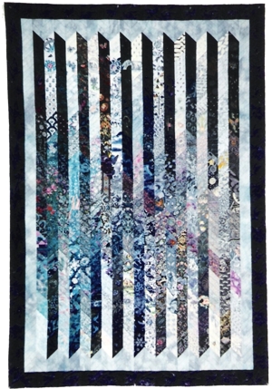
One is Crooked
1995,
47" x 38" Cotton.
Tubes sewn by machine and hand stitched together.
I love to
collect black and white fabrics, as does my friend, Mary Shepherd. So this was
fun to do. My favorite fabric in this quilt is one Mary bought several years
ago. It looks like rows of yearbook pictures. I was planning to have all the
vertical strips run perpendicular to the horizontal ones (like the warp on a
woven fabric). But, as I had it laid out, Alan came by
and said it was boring. He said I needed more whimsy. So one
is crooked. One is Crooked was exhibited in the 1996 Austin Area Quilt
Guild show.
Shades of Gray
1994,
50" x 66" Cotton.
Machine pieced and quilted.
This quilt started out as an
attempt to experiment with various designs that could be made with half-square
triangles (and an occasional square with an interesting accent fabric). It was
supposed to be just white, grey, and black, but that was too boring. First I
added the fabrics with small bits of color. But there was still no spark, so I
added the red stripe. When I added the plain border, the whole thing still
seemed static. So I let a couple of the designs flow into the border, which
created a bit more sense of motion. Shades of Grey was
exhibited in the 1994 Austin Area Quilt Guild show.
1994,
90" x 85" Cotton.
Machine pieced and quilted. This quilt was supposed to be pastel, with small
areas of medium value for contrast. But I needed over 1500 different
rectangles, so I started cutting from all the fabrics I could find. I
discovered that my friends and I gravitate toward deeper colors. We also have a
lot more reds and blues than we do yellows and oranges. Once I got bored with
cutting rectangles, I sketched a very rough layout for the various colors. The
uneven bargello design is meant to suggest the sort
of semi-controlled motion of a waterfall. Almost all the fabrics contain a
single salient hue, so each region reads strongly as a single color, just the
way the bands do in a rainbow. Once I had a very rough sketch, I started
putting pieces on my design wall. The final design really came more from the
fabrics than from anything else, as some regions grew and others shrank. Alan
calls this quilt "Dripping Colors".
Autumn Leaves
1994,
45" x 56" Cotton.
Machine pieced and embroidered. Machine quilted. Embellished.
I wanted to do a pastel colorwash. But such a thing, all by itself, would wash out and
be boring. I need some sort of contrast. I'd read Ruth McDowell's book, Pattern
on Pattern, and thought that her idea of one design literally superimposed on
another was a really great idea. So I decided to see-through burgundy leaves to
my pastel colorwash. When the leaves fell on top of
yellow, they'd be orange. On pink, they'd be deep burgundy. On blue, they'd be
purple. Of course, there are more at the bottom, gravity being what it is. When
it came time for the border, I went to the quilt store thinking that what I
really needed was leaf prints that weren't green. I wouldn't have bet much that
I'd find them. In fact, I got to choose, there were so many. So the border
itself is a colorwash. Mary Shepherd and I used
Autumn Leaves as a sample in our 1995 AAQG Gift of Quilting Class, Pastel
Pizzazz.
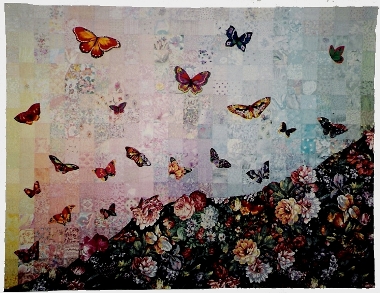
Metamorphosis
1995,
47" x 62" Cotton.
Machine pieced, hand appliquéed, and machine quilted.
I wanted to take another shot
at a pastel colorwash. This time I thought that,
instead of piecing in the contrasting design, I'd appliqué it on. I love
butterflies, and there are some great butterfly fabrics available. The bottom
of the quilt is meant to represent ground. It has flowers all over it. The top,
obviously, is the sky. It's filled with butterflies. Alan suggested making a
gradual transition from flowers to butterflies. Nature doesn't do it that way,
but it's interesting in a quilt. So the butterflies at the bottom of the quilt
are part flower, part butterfly. As you move up, you get to the 100% butterflies.
To make this quilt, I needed a foundation. Rather than adding batting to the
quilt, I just left the foundation there and quilted through the top, the
foundation, and the back. I found the perfect back for this quilt. It's a
butterfly design, done completely in pastels. Mary Shepherd and I used
Metamorphosis as a sample in our 1995 AAQG Gift of Quilting Class, Pastel
Pizzazz.
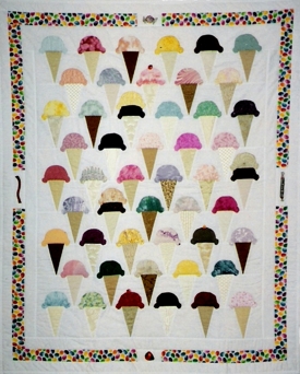 53
Flavors
53
Flavors
1993, 42" x 53"
Cotton, Machine pieced, hand appliquéed, and machine quilted.
This quilt was inspired by a
picture on the back of a menu at a 50's revival diner. I looked at the sort of
air-brushed picture of an ice cream soda and suddenly realized I could do ice
cream in fabric. Collecting the ice cream fabrics turned out to be easy. Some
hand dyed and marbled ones worked particularly well. The cones were a bit more
of a problem, so there are some duplicated fabrics in them. The jelly beans in
the border tie the colors together and the candies in the border insets
reinforce the "sweets" theme. The back of this quilt is perfect --
it's huge ice cream cones with dripping pink ice cream. Mary Shepherd found it
for me.
 Flowing
Blues
Flowing
Blues
1992,
84" x 84" Cotton.
Machine pieced and quilted.
This is a graduated quilt
that I made as a wedding present for my friends Susan Brienza
and Jeffrey Rubin-Dorsky. Their initials, S and J,
are in the medium blue region in the bottom half of the quilt. The bluebonnets
in the center represent the fact that the quilt was made in
2000,
84" x 84" Cotton.
Machine pieced and hand appliquéed, machine quilted.
I fell in
love with Provençal fabrics on a trip to
Finally
1997,
84" x 84" Cotton.
Machine pieced and quilted.
I made this quilt as a
wedding present for my friends, David Jefferson and Kathy Gilcrest, who were
married in September, 1996 after the longest courtship on record. The quilt is
a scaled up version of
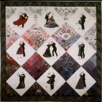
Dancers
1991, 42" x 42"
Silk and cotton. Hand appliquéed, machine pieced,
hand quilted.
I made this quilt for my
father, who, at the age of 70, took up dancing, and has
become almost as fanatic about it as I have about quilting. The nonappliquéed blocks form a graduated "subquilt" that serves as a background for the appliquéed dancers. The subquilt
is graduated, and flows from light to dark and from pink to purple. It simply
wasn't possible, at the time I was making this quilt, to find enough pink and
purple on white background fabrics, so several of the pieces at the top of the
quilt were hand painted, often starting with a black and white print and then
filling them in with pink and purple. Dancers was
displayed at the 1992 Austin Area Quilt Guild show and at the 1992 IAQA show in