Unit 2.1.1 Launch
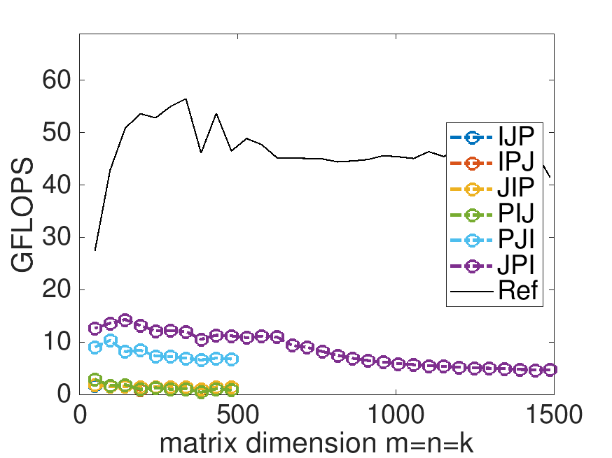
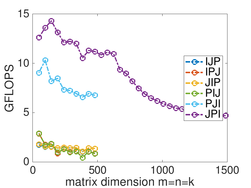
¶Last week, you compared the performance of a number of different implementations of matrix-matrix multiplication. At the end of Unit 1.2.4 you found that the JPI ordering did much better than the other orderings, and you probably felt pretty good with the improvement in performance you achieved:
Homework 2.1.1.1.
In directory Assignments/Week2/C/ execute
make JPIand view the results with the Live Script in
Assignments/Week2/C/data/Plot_Opener.mlx. (This may take a little while, since the Makefile now specifies that the largest problem to be executed is \(m=n=k=1500\text{.}\))
Next, change that Live Script to also show the performance of the reference implementation provided by BLIS: Change
% Optionally show the reference implementation performance data
if ( 0 )
to
% Optionally show the reference implementation performance data
if ( 1 )
and rerun the Live Script. This adds a plot to the graph for the reference implementation.
What do you observe? Now are you happy with the improvements you made in Week 1?
On Robert's laptop:
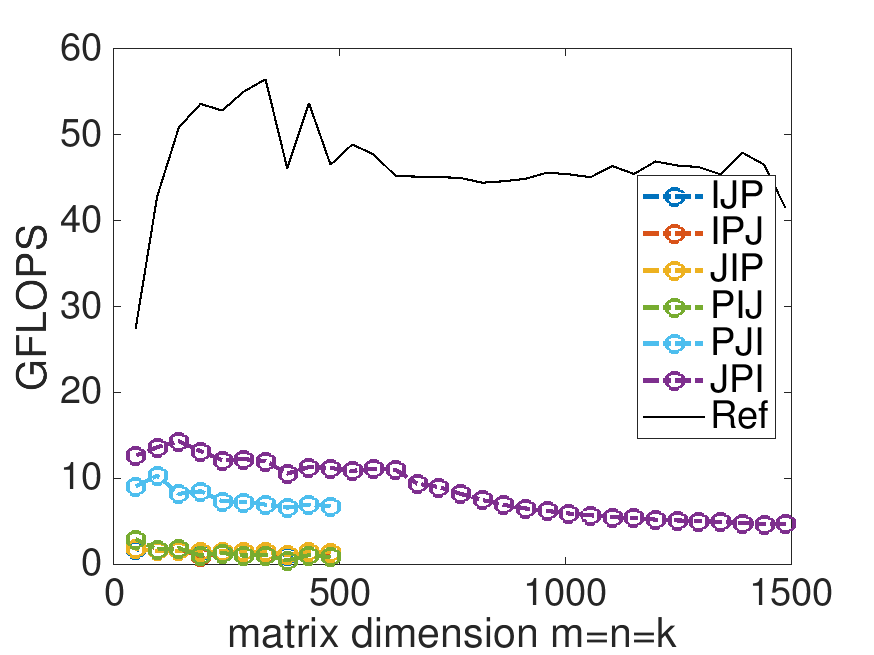
Note: the performance in the graph on the left may not exactly match that in the graph earlier in this unit. My laptop does not always attain the same performance. When a processor gets hot, it "clocks down." This means the attainable performance goes down. A laptop is not easy to cool, so one would expect more fluxuation than when using, for example, a desktop or a server.
Remark 2.1.1.
What you notice is that we have a long way to go... By the end of Week 3, you will discover how to match the performance of the "reference" implementation.
It is useful to understand what the peak performance of a processor is. We always tell our students "What if you have a boss who simply keeps insisting that you improve performance. It would be nice to be able convince such a person that you are near the limit of what can be achieved." Unless, of course, you are paid per hour and have complete job security. Then you may decide to spend as much time as your boss wants you to!
Later this week, you learn that modern processors employ parallelism in the floating point unit so that multiple flops can be executed per cycle. In the case of the CPUs we target, 16 flops can be executed per cycle.
Homework 2.1.1.2.
Next, you change the Live Script so that the top of the graph represents the theoretical peak of the core. Change
% Optionally change the top of the graph to capture the theoretical peak
       if ( 0 )
         turbo_clock_rate = 4.3;
         flops_per_cycle = 16;
to % Optionally change the top of the graph to capture the theoretical peak
if ( 1 )
turbo_clock_rate = ?.?;
flops_per_cycle = 16;
where ?.? equals the turbo clock rate (in GHz) for your processor. (See Unit 0.3.1 on how to find out information about your processor).
Rerun the Live Script. This changes the range of the y-axis so that the top of the graph represents the theoretical peak of one core of your processor.
What do you observe? Now are you happy with the improvements you made in Week 1?
Robert's laptop has a turbo clock rate of 4.3 GHz: